Circular Gallifreyan
Previously, Loren Sherman proposed a grapheme-based script to stylize English as a Gallifreyan-style script. We find the necessity of encoding different phonemes multiple times (e.g., ‘c’ or ‘q’) results in cumbersome diacritics, e.g., triple or quadruple dots.
Consonants
Naïvely, we wanted to use circles at varying depths relative to the main word circle to parallel how the International Phoenetic Alphabet organizes phonemes. In particular, we wanted the position of the circle to indicate the oral posture. Next comes the question of how to use diacritics. For this, we take inspiration from the Japanese Hiragana/Katakana syllabaries. There are two modifiers: the dakuten, which (loosely) indicates when an unvoiced consonant should be voiced, and the handakuten, which (again, loosely) indicates when a fricative should be pronounced as a plosive instead. For instance, the hirigana た “ta” becomes だ “da” with the dakuten; similarly, ふ “fu” becomes ぷ “pu.” We use the diacritics proposed by Sherman in a similar manner.
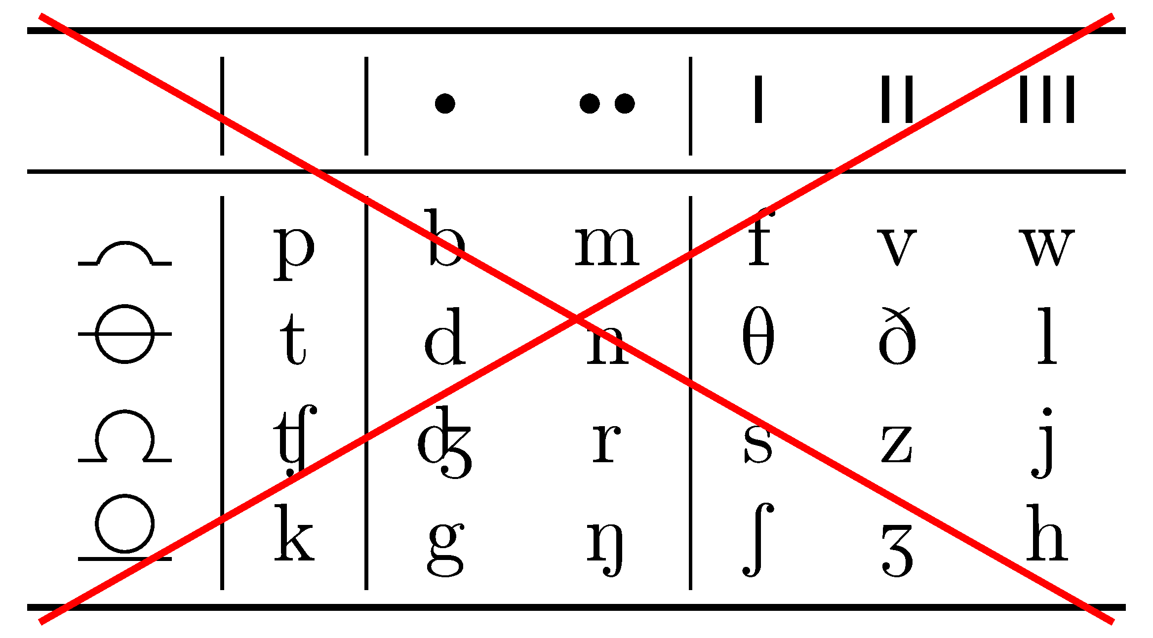
This “postural” approach makes connecting words difficult, however, since very rarely do the “nestable” consonants appear. Rather, it is more appealing orthographically to give the most common consonants the ability to nest:
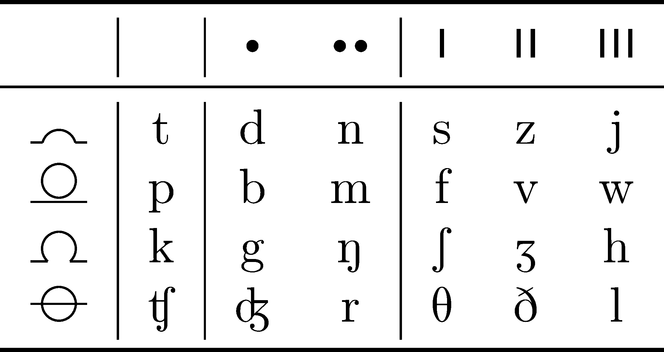
In general, no diacritics are the base unvoiced plosives, a single dot the corresponding voiced plosives; a single line the unvoiced fricatives, and double line the corresponding voiced fricatives. For the most part, double-dot indicates nasal, and triple line as a catch-all.
Vowels
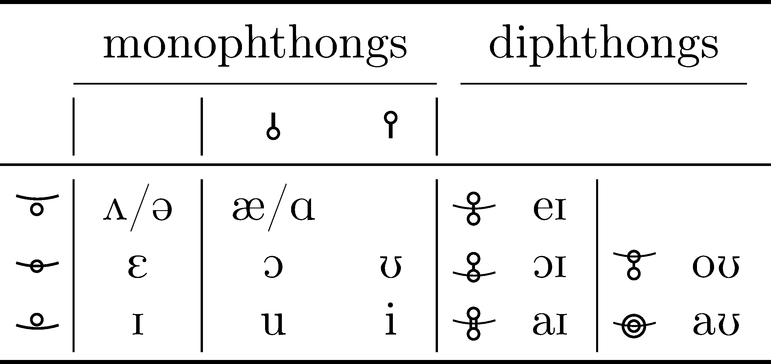
Vowels are annoying instead due to diphthongs. Often in phonetic transcriptions of English, in e.g., shorthand, vowels are omitted and understood from context. While in shorthand, this allows for much faster transcription, this often leads to misinterpretation. This is beacause the English language has around ten monophthongs and five diphthongs, depending on dialect. We specialize to vaguely General American pronunciations. The choice of the vowel dictionary comes primarily from wanting the diphthongs to have nice ligatures, and the direction of the connecting line being loosely the direction the dipthong goes (from low to high):
Example Sentence
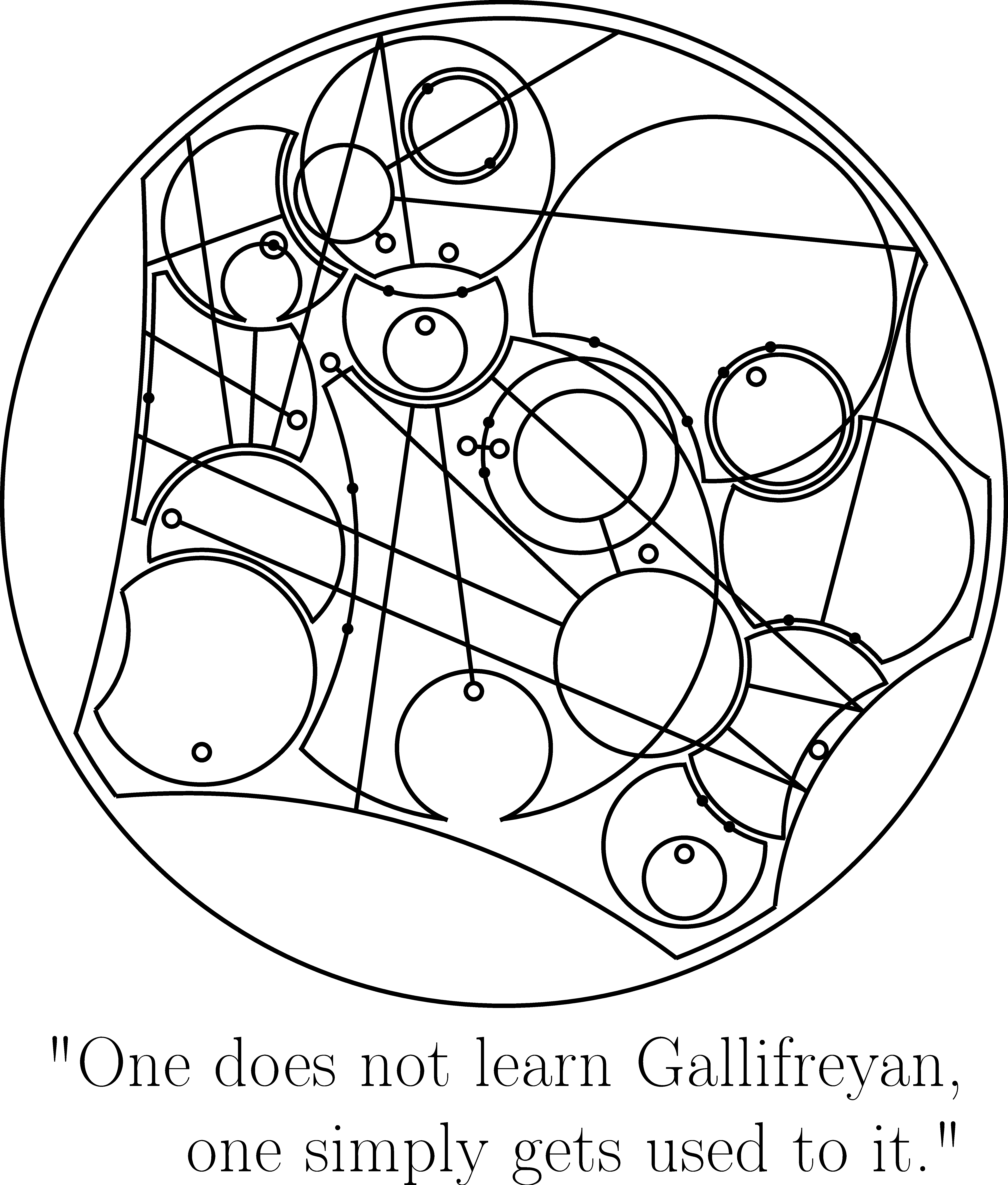
Words are read starting from the bottom, in an anti-clockwise pattern, as proposed by Sherman; linear sentences are read in the expected manner, while branching and looped sentences are understood from context (I’m definitely not being lazy). In the case of repeated shapes, e.g. “bump,” we can stack letters. Rather than the thickness ordering proposed by Sherman however. For me, one of the most annoying aspects of shorthand is the loose categorization into “pen” and “pencil” shorthands. In “pen” shorthands, e.g., Deutsche Einheitskurzschrift, lineweight is used to differentiate graphemes, as the then common fountain pens afforded this quite easily. In contrast, one cannot do the same with a pencil, so “pencil” shorthands, e.g., Gregg, use different mechanisms to distinguish graphemes. Trying to control lineweight while learning a new orthography can feel like too much at once; as such, we propose concentric ordering rather than thickness ordering, where nested consonants are read in-out. We conclude with a single example sentence, an adaptation of a quote by John von Neumann:
Yes, I made all of the images in TikZ.